This website works best with a newer web browser such as Chrome, Firefox, Safari or Microsoft
Edge. Internet Explorer is not supported by this website.
1-minute Mesoscale Domain Sector GOES-18 (GOES-West) Visible images with an overlay of the Fire Mask derived product (above) showed the Old Trails Fire (initially named the Euclid Fire) as it started around 1907 UTC on 01 August 2026 — then grew rapidly as strong SW winds (with gusts as high as 40 knots) caused the... Read More
1-minute GOES-18 Visible images with an overlay of the Fire Mask derived product, from 1901 UTC on 01 August to 0300 UTC on 02 August; METAR surface reports are plotted in cyan, Interstate 90 is plotted in red and State Highways are plotted in gray
1-minute Mesoscale Domain Sector GOES-18 (GOES-West) Visible images with an overlay of the Fire Mask derived product (above) showed the Old Trails Fire (initially named the Euclid Fire) as it started around 1907 UTC on 01 August 2026 — then grew rapidly as strong SW winds (with gusts as high as 40 knots) caused the wildfire to quickly expand into northwestern portions of the Spokane, Washington area (forcing numerous evacuations). SPC had highlighted much of eastern Washington as having an Extreme Fire Risk on that day — and NWS Spokane issued its first-ever Particularly Dangerous Situation (PDS) Red Flag Warning for the area.
1-minute GOES-18 GeoColor RGB images with an overlay of Next Generation Fire System (NGFS) Fire Detection polygons (below) provided a better view of the thermal structure/intensity of wildfires in the Spokane area.
1-minute GOES-18 GeoColor RGB images with an overlay of NGFS Fire Detection polygons, from 1900 UTC on 01 August to 0200 UTC on 02 August
1-minute GOES-18 True Color RGB images from the CSPP GeoSphere site (below) displayed a larger-scale view of the smoke plumes produced by the Spokane area wildfires. A few intermittent pulses of brighter-white pyrocumulus clouds were seen immediately downwind of the Old Trails Fire.
1-minute GOES-18 True Color RGB images, from 1900 UTC on 01 August to 0159 UTC on 02 August
According to the Tokyo VAAC, Sheveluch (located on Russia’s Kamchatka Peninsula) erupted around 0508 UTC (text | image) on 31 July 2026. A signature of the resulting volcanic cloud became apparent in 10-minute Full Disk scan GOES-18 (GOES-West) Ash RGB images (above) and Dust RGB images (below), created using Geo2Grid. Brighter shades... Read More
10-minute GOES-18 Ash RGB images, from 0700 UTC on 31 July to 1200 UTC on 01 August
According to the Tokyo VAAC, Sheveluch (located on Russia’s Kamchatka Peninsula) erupted around 0508 UTC (text | image) on 31 July 2026. A signature of the resulting volcanic cloud became apparent in 10-minute Full Disk scan GOES-18 (GOES-West)Ash RGB images (above) and Dust RGB images (below), created using Geo2Grid. Brighter shades of yellow in both RGB image types were indicative of a mixture of ash and SO2 within the volcanic cloud. The volcanic cloud signature eventually became lost within a band of meteorological clouds associated with a cold front south of the Aleutian Islands.
10-minute GOES-18 Dust RGB images, from 0700 UTC on 31 July to 1200 UTC on 01 August
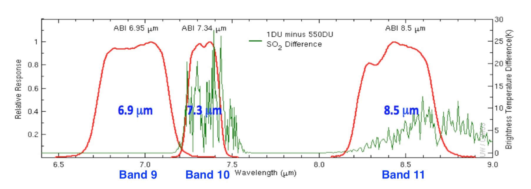
GOES-18 Split Cloud Top Phase images (below) included plots of Pilot Reports (PIREPs) and Volcanic Ash Advisory/Forecast polygons issued by the Anchorage VAAC. The 8.4 µm spectral band is sensitive to SO2 absorption which led to positive values (brighter green to yellow to red) in the imagery.
10-minute GOES-18 Split Cloud Top Phase brightness temperature difference, with plots of Pilot Reports and Volcanic Ash Advisory/Forecast polygons, from 0800 UTC on 31 July to 1210 UTC on 01 August
As the volcanic cloud advanced farther eastward across the Bering Sea, advisory responsibility was transferred from the Tokyo VAAC to the Anchorage VAAC, beginning at 1500 UTC on 31 July (below). The leading, faster-moving portion of the volcanic cloud had a maximum altitude of FL340 (34000 feet) — while the trailing, slower-moving portion had a maximum altitude of FL250 (25000 feet).
GOES-18 Split Cloud Top Phase image at 1500 UTC on 31 July, with the initial Volcanic Ash Advisory/Forecast polygons issued by the Anchorage VAAC for this event [click to enlarge]
Wile many aircraft were flying above the FL340 (34000 feet) maximum altitude of the leading portion of the volcanic cloud, there were some pilot reports of Volcanic Ash (VA) clouds either in the distance or below the altitude of the aircraft (below).
GOES-18 Split Cloud Top Phase image at 1630 UTC on 31 July, with a Pilot Report of possible Volcanic Ash (VA) to the NW [click to enlarge]
GOES-18 Split Cloud Top Phase image at 2310 UTC on 31 July, with a Pilot Report of VA at 29000 ft and below [click to enlarge]
The final Anchorage VAAC advisory for this event was issued at 1209 UTC on 01 August (below), as the volcanic cloud was approaching the Washington VAAC area of responsibility.
GOES-18 Split Cloud Top Phase image at 1210 UTC on 01 August, with the final Volcanic Ash Advisory issued by the Anchorage VAAC for this event [click to enlarge]
While the Pacific has kept seeing its share of intense tropical systems, the Atlantic has been quieter. This is consistent with what we expect with a strong El Niño, as the global scale impacts from that phenomenon tend to include increased wind shear in the Caribbean and western Atlantic which... Read More
While the Pacific has kept seeing its share of intense tropical systems, the Atlantic has been quieter. This is consistent with what we expect with a strong El Niño, as the global scale impacts from that phenomenon tend to include increased wind shear in the Caribbean and western Atlantic which prevents storms in the tropics from intensifying and consolidating into cyclones. But we’re also seeing another major inhibitor of tropical cyclone development in large quantities of Saharan dust streaming off of north Africa into the skies over the eastern Atlantic. The air associated with these dust plumes is very dry, having originated over one of the largest and driest deserts on Earth. When this air is advected over the Atlantic, it mixes with the existing air and disrupts the development of any deep convection while also enhancing local wind shear. The radiative impact of the dust also stabilizes the atmosphere by absorbing solar energy above the surface while preventing warming at the surface, thus increasing the strength of the trade wind inversion and further limiting the vertical growth that is critical for hurricane formation and maintenance.
Since we’re interested in an African phenomenon, the geostationary satellites operated by EUMETSAT are going to be well-positioned to investigate this. The Flexible Combined Imager (FCI) on the geostationary Meteosat 12 plaform captured the following true color animation of the brown dust stretching hundreds of miles off of the shore of Africa and into the Atlantic air. FCI, like the Himawari Advanced Himawari Imager (AHI) has true red, green, and blue channels and is thus able to depict and event like this with chromatic fidelity. This animation was made on the EUMETSAT’s Eumetview site.
Of course, dust has different radiative properties than clear or cloudy air does, and with the numerous channels on the FCI, we can exploit those differences to create a Dust RGB product that highlights the position of the dust. Here’s the same period and time window as the true color animation above, but this time see how the dust can be made visually distinct from its surroundings through the application of infrared channel differences. The full recipe is given in the Dust RGB Quick Guide from EUMETSAT. Here, the purple and magenta colors represent the locations of the dust. Note how this product is even able to distinguish between a dust storm on the Algeria/Mali border (the bright magenta on the right side of the animation) from the surrounding desert; this is almost impossible to see in the true color loop above. The Dust RGB uses only infrared channels (including differences between different infrared channels) so it can be used 24 hours a day without issue.
Dust in the air, of course, means an increase in the optical depth. As this dust streams westward, it emerges into the field of view of the GOES-19 (GOES East) Advanced Baseline Imager (ABI). Here’s an animation from CSPP Geosphere that shows the Level 2 Aerosol Optical Depth product from the CSPP Geo software suite. This view shows data on the curved surface of the earth, with northern South America in the bottom left and western Africa curving away from the viewer in the middle. The dust can be seen as the bright colors at the center of the animation. As the day goes on, clouds in the dust region grow and thicken. Since the aerosol optical depth product is a clear sky and daytime only product, this results in increasing areas of the loop showing no data.
Finally, we can use VIIRS to take a very high resolution view of the dust. Unlike geostationary satellites which are fixed to specific locations, NOAA’s polar orbiting satellites roam the entire planet. Here’s a true color view from NOAA-21. The 375 m spatial resolution of the raw visible-wavelength channels enables ultra-detailed views of the dust, as can be seen in this image of the Atlantic between the Cap-Vert peninsula that is home to Dakar, Senegal on the right and the islands of Cabo Verde on the left.
These dust plumes aren’t uncommon this time of year, and have even been known to make their way all the way to the continental United States where they can affect everything from air quality to the beauty of the sunsets.
2.5-minute Target Sector Himawari-9 Visible images (above) and Infrared Window images (below) showed Super Typhoon Dolphin as it reached 150-knot Category 5 intensity (ADT | D-MINT | SATCON) over the West Pacific Ocean (north of the Marshall Islands) at 2100 UTC on 29 July 2026. Mesovortices were evident within the... Read More
2.5-minute Himawari-9 Visible images, from 1852 UTC on 29 July to 0712 UTC on 30 July
2.5-minute Target Sector Himawari-9 Visible images (above) and Infrared Window images (below) showed Super Typhoon Dolphin as it reached 150-knot Category 5 intensity (ADT | D-MINT | SATCON) over the West Pacific Ocean (north of the Marshall Islands) at 2100 UTC on 29 July 2026. Mesovortices were evident within the eye — and periodic swirls of mid- to upper-level cloud material appeared to be shedding from the inner edge of the eyewall, suggesting that the mesovortex circulations (which are normally rather shallow) were fairly deep in this case.
2.5-minute Himawari-9 Infrared Window images, from 1852 UTC on 29 July to 0712 UTC on 30 July
Synthetic Aperture Radar (SAR) imagery (below) from around the beginning and ending times of the Himawari-9 animations displayed an apparent break in the eyewall, with hints of narrow wind features that were similar in appearance to the cloud filaments seen in Himawari images. Dolphin was also undergoing an eyewall replacement cycle during this time period.
Sentinel-1D SAR wind mage at 1845 UTC on 29 July [click to enlarge]
Sentinel-1D SAR wind image at 0714 UTC on 30 July [click to enlarge]