
The National Weather Service offices in much of the central and western continental United States have modified their radiosonde launch times. Instead of the standard synoptic times of 0000 and 1200 UTC, these offices have shifted that latter time to 1800 UTC. Since radiosondes are labor-intensive, this change to the middle of the day helps ensure that sufficient staffers are around to launch the balloon and maintain operational readiness. Here, courtesy of the NOAA Storm Prediction Center, is a slider juxtaposition of a map of the 1200 and 1800 UTC radiosonde launches showing how the majority of the missing 1200 UTC sites are instead showing up at 1800 UTC.
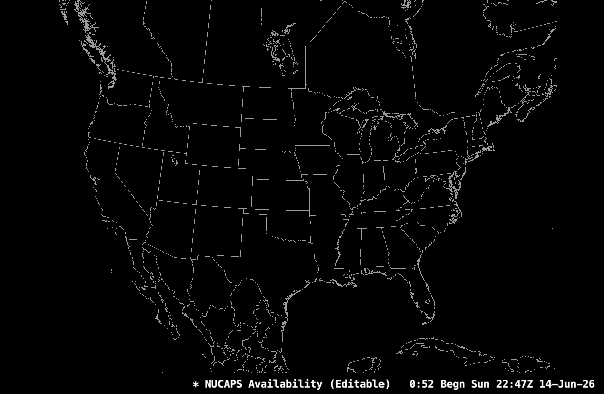
Of course, if you are used to looking for radiosondes at certain times, this shift might be disruptive to your workflow. Here’s a case where satellites can once again come to the rescue by helping to fill in those gaps. This blog has frequently talked about the advantages of the NUCAPS product, in which combined infrared and microwave sounders deliver vertical profiles of temperature and dew point from the polar orbiting NOAA-20 and NOAA-21 satellites. While they don’t give the same vertical resolution as the radiosondes, they make up for it in observational density. Here’s an animation of the distribution of NUCAPS profiles across North America from the NOAA LEO satellites. Remember, this can be used as a proxy radar: green is where both infrared and microwave satellite retrievals are available and thus are indicative of clear skies; yellow is where microwave is available but infrared isn’t, and thus shows where the skies are cloudy, and red is where neither infrared nor microwave are valid and thus shows where it is raining. This animation shows roughly 18 hours of NUCAPS availability over CONUS, from 0000 UTC on Sunday the 14th to 1800 UTC on the 15th.
Of course, the temporal gaps cannot be ignored. One thing to do is use the GOES Legacy Atmospheric Profile (LAP) products instead. These are not going to have the same vertical detail as the NUCAPS soundings because they don’t have the same information content. While there are many hundreds of channels from the infrared CrIS sounder, the GOES LAP product just uses the ABI channels. This results in a reduced ability to capture small-scale features compared to the hyperpsectral CrIS sounder. At the same time, there’s no microwave instrument in geostationary orbit. This means that GOES soundings can only happen in locations where skies are clear since clouds are opaque to infrared radiation and thus block all radiation originating from the surface. However, unlike NUCAPS, the GOES soundings have far greater temporal availability given their basis in geostationary observations.
A little over a year ago, we wrote a blog post discussing the LAP products, and we encourage you (and NWS users in particular) to check it out to see how to access these soundings and learn about their applications and limitations.
The next generation of US geostationary satellites, GeoXO, promises to unite the vertical resolution of the existing LEO satellites with the temporal resolution of geostationary orbit. The GeoXO Sounder (GXS) will provide hyperspectral observations from geostationary orbit, drastically improving both the temporal and spatial resolution of the sounding observations. Similar observations are already underway from EUMETSAT’s MTG-IRS and China’s GIIRS, and we can expect Japan’s Himawari-10 to be operational in the coming years as well. It is truly an exciting time for people, like your author, who are fans of hyperspectral thermodynamic profiling!
View only this post Read Less


