
Here is a map showing several satellite images pieced together on top of temperature data of the land and oceans. The milky white and gray areas outline where the clouds are. The bright white at the north and south poles indicates ice. The yellows, orange and browns indicates the temperature of the continents (plus some purples representing very cold land at the south pole) and the different shades of turquoise indicate sea surface temperatures. Scientists call this a global montage.
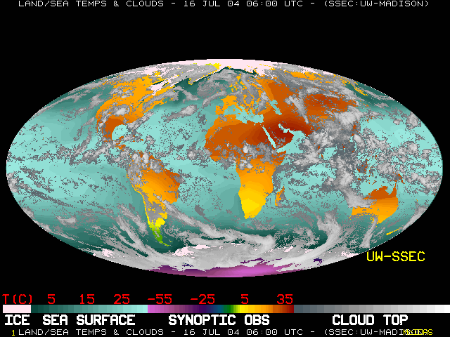
This type of map with the whole Earth stretched out onto one surface is called a Mollweide projection. Next we'll look at a series of these maps in an animated loop. Watch for awhile and see if you can pick out where the trade winds are, monsoons in India, the Intertropical Convergence Zone (ITCZ) along the equator, how the land heats up in the day and cools down at night, and changes in ocean temperatures.Please click here for a full month of images that are 6 hours apart. (4 images each day) There is a LOT of information in this series of images, take some time and take some notes while you watch the animation.