CONTOUR ANALYSIS
To understand atmospheric and oceanic circulations, you must be able to
understand how variables (temperature, pressure, winds, humidity, clouds,
salinity) are changing in time and how they are changing with respect to
one another. The weather map is a tool that aids this understanding.
Various kinds of maps, or charts, are used to graphically depict these
variables. A good map allows you to quickly identify patterns. For
example, a weather map of forecasted high temperatures typically available
in newspapers indicates the location of warm and cold regions of the country.
From these maps you can quickly gage the predicted high temperature for
your town.
Maps depicting weather and ocean conditions are drawn based on simultaneous
observations made at many places throughout the world. Accurate portrayal
of these observations is the key to a correct interpretation of the data.
Meteorologists and oceanographers use a technique called contour analysis
to visually explain the information the data is providing. Contouring
data represents an elementary step in data analysis. Ability to correctly
and confidently analyze data is critical to interpreting conditions.
For example, contouring is vital in:
-
finding the location of atmospheric and oceanic fronts,
-
locating potential regions of severe thunderstorms,
-
tracking hurricanes,
-
tracking the movement of pollutants.
-
tracing water movement in the oceans
A series of interactive web exercises follow which enable you to
practice contouring. First, some information about contouring.
An isopleth is a line of equal value (a Greek word iso -
equal; pleth - value). Contouring is the process of
drawing isopleths. A weather map contains isopleths of different
weather parameters (Table of common isopleths).
For example, maps of forecasted high temperatures have contours of constant
temperature, or isotherms (iso-equal; therm-temperature).
On these maps, anywhere along the 70 degree isotherm the forecasted high
temperature is 70 degrees.
Contouring data can be difficult because observations are not made everywhere.
Gaps in the observations exist and we must interpolate between the existing
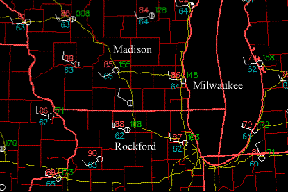
weather observations. For example, the weather map below depicts weather
conditions on July 15, 1997 at 1900Z in the southern Wisconsin and the
surrounding states. The red numbers are the observed temperatures,
in degrees Fahrenheit. The city of Madison, WI has a temperature
of 85F while Rockford, IL has a temperature of 88F. If you where
to drive from Madison to Rockford on I90 (the yellow line) with a thermometer,
along the way you would measure temperatures of 86F and 87 F. If
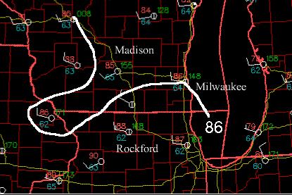
we were to draw an isotherm of 86F, this isotherm would have to pass between
Madison and Rockford, and through the city of Milwaukee, WI where the observed
temperature is 86F. The adjacent map analyzes the 86F isotherm as a thick
white line. Ocean data is even more sparse than weather data!


Contoured maps are common. You see them in the weather section of your
newspaper, a map of the Earth often includes two contour analyzes -- one
of latitude and the other longitude, and hiking maps depict lines of constant
elevation.
Follow these general rules of contouring
as you analyze these maps:
-
isopleths should never cross,
-
isopleths should not branch or fork,
-
only the area on the map that has data should be contoured,
-
you should label your isopleths (in these exercises we will color code
them).
When you finish contouring check your results. One way to do this,
is to imagine that you are walking along an isopleth. The values of the
data points one side of the line should all be greater than, or all of
them should be less than the value of the isopleth.
Lesson 1: Introduction to contouring
In this first exercise, you will use the mouse to practice contouring.
You might start analyzing a contour by drawing tic marks on the map to
mark where the isopleth should be, then connect the dots. Don't worry
about trying to get the lines perfectly smooth. The purpose is for
you to gain an understanding of how contouring is accomplished. Notice
that contour lines cannot cross, but they can form closed loops.
Lesson 2:
Learning the Basics
In this next exercise, you will again use the mouse to contour a map.
You will be presented with a series of plotted data points that will determine
the contoured field. Contour the field before looking at the answer!
As you go through this first exercise notice how the contour field changes
as you add observations to the map. The more observations you have,
the better the field is defined.
Lesson 3: Intermediate Level
To become adept at contouring requires
practice!
When you are done with this map, notice the spacing of the contours. The
spacing of the isopleths indicates how rapidly conditions are changing
in the horizontal direction. The gradient of a variable describes
how much the variable changes over a given distance. The more densely
packed the isopleths, the larger the gradient.
Lesson 4: Working
with Real Data
In this exercise you will be presented with observations of surface dew
point temperatures on 1200 UTC, July 18, 1996. Unlike the previous
exercises, all the observations are plotted on the map at once. But
don't let this bother you. Before drawing your first contour invest
some time in preparation.
-
First look over the numbers and search for continuity.
-
Are there regions where the numbers are changing rapidly (large gradients)?
-
Are there regions of the map where there is little variation in the numbers
(referred to as a flat field)?
-
What is the largest and smallest number?
-
Starting with two observations begin drawing your first contour.
-
Then mentally add in surrounding pairs of observations as you continue
to draw the contour. If you make a mistake you can hit the "Erase
Last Line" button, or just ignore the line.
In real analysis lab, you would be using a pencil instead of a computer
mouse so that you can erase the inevitable mistakes.
Lesson 5: Working
with Weather Maps
In this exercise you will be presented with a weather map
that includes observations of temperature, dew point temperature,
and wind speed and direction made at 1400UTC on July 18, 1996. On
this day a tornado touched in in Oakfield, WI. The observations are
all plotted on the map at once, so don't get temperature confused with
the dew point! Do you notice a relationship between temperature and
dew point?
Lesson 6: Working with Ocean Maps
Oceanography is another science that uses contouring to analyze
data. In this exercise you will be presented with salinity data measured
in the Mediterranean Sea. When compared to weather observations taken
over land, there are very few observations made in the oceans. No
matter what the data source, the approach to contouring is the same.
Lesson 7: Contouring Potential Temperatures
in the Mediterranean
Potential temperature is an important variable in oceanography
and meteorology. It is a conserved variable and is therefore a good tracer.
GENERAL RULES
OF CONTOURING:
The more contouring you do the better you will be at interpreting weather
maps. In lab session you will be doing contouring on paper weather
maps using a pencil. A few guidelines to remember when doing the
lab exercises:
1) Prepare to contour
A. Search for continuity (time and space) on the weather map
B. Eliminate what appears to be faulty, or incorrect, data
C. Locate regions of high and low values
D. Review data to determine isopleth spacing
2) Drawing the map
A. Use a pencil !!
B. Draw smooth lines
C. Interpolate between given values to correctly place an isopleth
D. Isopleths cannot touch or cross
E. Isopleths cannot branch or fork
F. Be neat and accurate
G. Label the isopleths
3) Review your map
A. Do a gross check of isopleths for accuracy
B. If necessary, trace over pencil with final marker (be neat)
C. Check for proper labeling
4) Your map is now ready for interpretation!
Table of common isopleths:
| Isobar |
Pressure |
| Isotherm |
Temperature |
| Isotach |
Wind Speed |
| Isogon |
Wind Direction |
| Isoshear |
Wind Shear |
| Isodrosotherm |
Dew point |
| Isohyet |
Precipitation Accumulation |
| Isohaline |
Salinity |
| Isopycnic |
Density |
| Isohume |
Humidity |
| Isoneph |
Cloudiness |
| Isohel |
Sunshine |
Copyright 1997, University of Wisconsin-Madison, Space Science and
Engineering Center.
This contouring exercise was developed by Steve Ackerman and Tom Whittaker.
You are free to use it for educational purposes. We would appreciate knowing
what you are doing with the module and your suggestions for improvements.
You can send me comments.
