Surface Air Temperatures
Earth's top ten warmest years have all occurred in this century. Note that the rate of temperature increase is “accelerating”, depicted by the slope of the colored lines on the following chart.
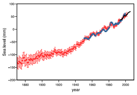
Sea Level
Sea level change is non-uniform spatially; in some regions, rates are several times the global mean rise.
This graph depicts annual averages of the global mean sea level in millimeters (mm). The red curve shows reconstructed sea level fields since 1870; the blue curve shows coastal tide gauge measurements since 1950 and the black curve is based on satellite altimeter. The red and blue curves are deviations from their averages for 1961 to 1990, and the black curve is the deviation from the average of the red curve for the period 1993 to 2001. Error bars show 90% confidence intervals.
All sections indicate that global mean sea level has been rising, furthermore, scientists have high confidence that the rate of sea level rise has increased between the mid-19th and the mid-20th centuries.
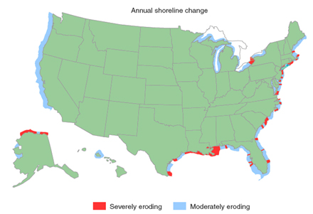
Shoreline Erosion
The graph below represents a preliminary assessment of the potential of shoreline erosion of the United States. The degree of erosion is associated with changes in sea level, the frequency of storms, and the condition of the shoreline.
The Atlantic and Gulf Coast coastlines are particularly susceptible. These regions have gentle slopes, and a rise in sea level results in a large change in the shoreline. A change in the frequency of storms along the coast, such as hurricane storm surges, can have a large impact on coastal erosion and flooding, putting lives and property at risk.
Sea level rise coupled with growing coastal populations and increased storm intensity will compound the need for coastal management that involves stringent land-use policies and other adaptation strategies.
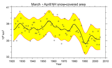
Average Snow Cover
This graph depicts Northern Hemisphere (NH) average snow-covered area (SCA). Values of SCA before 1972 are based on the station-derived snow cover index; values beginning in 1972 are from NOAA satellite data. The smooth curve shows decadal variations, and the shaded area shows the 5 to 95% range of the data estimated after first subtracting the smooth curve.
Recent SCA declines reveal:
(1) a shift in the max SCA from February to January;
(2) a decline in annual mean SCA;
(3) a shift towards earlier spring melt.
These traditional SCA observations are confirmed by 21st-century NASA and NOAA Earth Observing System (EOS) satellite missions.
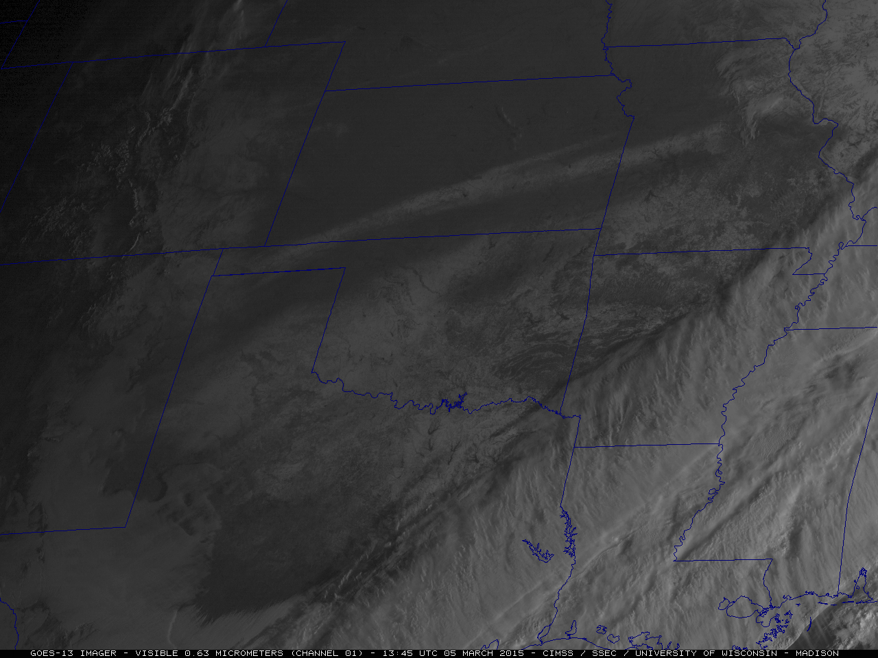
5) Satellite Images
The premier data set used to evaluate large-scale snow covered area (SCA), which dates to 1966 and is the longest satellite-derived environmental data set of any kind, is the weekly visible wavelength satellite maps of NH snow cover produced by NOAA.
More recently, scientists have been incorporating snow cover data from the visible-spectrum in the MODIS and VIIRS instruments as well as passive microwave sensors on polar orbiting satellites. Both data sets have a higher spatial resolution than their predecessors which should lead to increased accuracy in snow mapping.