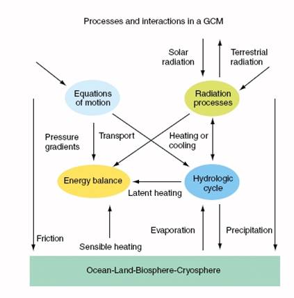
Model Schematic
This figure is a schematic of the atmospheric processes of a climate model. These interactions are expressed in a global climate model (GCM) as a series of mathematical expressions in computer code.
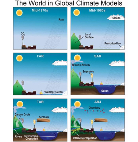
Model Complexity
The complexity of climate models has increased over time. Additional physics incorporated in climate models are shown pictorially in this IPCC figure below. As with today's weather models, climate models continue to improve and are essential to understanding changes in our atmosphere. "FAR" represents the type of processes included in the IPCC First Assessment Report, "SAR" refers to the IPCC Second Assessment Report, and "TAR" is the Third Assessment Report. AR4 represents the type of processes included in the Fourth Assessment Report. Note the additions over time! The most current IPCC report, AR5, has even more physics included in climate projection models.
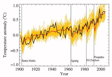
Surface Temperatures
One way to test the robustness of climate models is to compare simulations with observations. This IPCC graph shows global observed near-surface 20th century temperatures in black compared to 58 simulations from 14 different climate models in yellow. The red line represents the mean of all the computer simulations, which includes both natural and human-induced forcings. Temperature anomalies are shown relative to the 1901-1950 mean. The vertical grey lines indicate the timing of major volcanic eruptions.
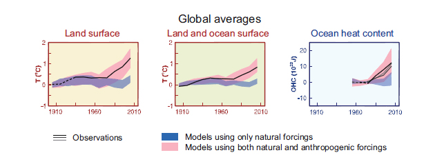
Comparing IPCC Models to Temperature Observations
This IPCC AR5 graph represents a comparison of observed and modeled climate change based on three large-scale indicators: change in continental land surface air temperatures (yellow panel), Arctic and Antarctic September sea ice extent (green panel), and upper ocean heat content (blue panel). Global average changes are also given. Anomalies are given relative to 1880–1919 for surface temperatures, 1960–1980 for ocean heat content and 1979–1999 for sea ice. All time-series are decadal averages, plotted at the centre of the decade. Dashed lines indicate sparse data, solid lines indicate good data coverage. Model results shown are Coupled Model Intercomparison Project Phase 5 (CMIP5) multi-model ensemble ranges, with shaded bands indicating the 5 to 95% confidence intervals.